Plug-and-Play Login UI
In this guide, you will learn how 'React/Next.js' Web3 apps can integrate with the Arcana Auth product and onboard users through the built-in, plug-and-play login UI.
Prerequisites
-
Make sure you can access the Arcana Developer Dashboard: https://dashboard.arcana.network
-
Use the Arcana Developer Dashboard to register and configure the app. The plug-and-play pop-up UI screen will display only those authentication providers that are configured using the Arcana Developer Dashboard. If no authentication providers are configured in the Arcana Developer Dashboard, then users can only onboard the app via the passwordless login option. See how to configure authentication providers for details.
-
Follow the instructions as per the app type and integrate the app with the Arcana Auth SDK and Arcana Auth React SDK. During integration, add code for the built-in login UI or the compact mode (optional) login UI.
Steps
The built-in, plug-and-play login UI is enabled by default.
Update the App.js file by importing Auth from the auth-react package and render it in the App function to bring up the default login UI component. You can configure the wallet UI theme layout using Auth component props. Once the user clicks to log in, they will see the built-in, plug-and-play login UI pop up in the app context displaying all the configured authentication providers.
import { StrictMode } from "react";
import { createRoot } from "react-dom/client";
import { AuthProvider } from "@arcana/auth";
import { ProvideAuth } from "@arcana/auth-react";

import App from "./App";

const rootElement = document.getElementById("root");
const root = createRoot(rootElement);
const provider = new AuthProvider(
  "xar_live_d7c88d9b033d100e4200d21a5c4897b896e60063",
  {
    network: "mainnet",
    theme: "light",
    connectOptions: {
      compact: true,
    },
    chainConfig: {
      chainId: "80001"
    }
  }
); //See SDK Reference Guide for optional parameters

root.render(
  <StrictMode>
    <ProvideAuth provider={provider}>
      <App />
    </ProvideAuth>
  </StrictMode>
);
import { Auth } from "@arcana/auth-react";


// Use <Auth/> to use the built-in, plug & play login UI
function App() {
  const [theme, setTheme] = React.useState("light");
  return (
    <div>
      <Auth theme={theme} />
    </div>
)}

export default App;
You can also use the useAuth hook and refer to the Auth component states.
import { useAuth } from "@arcana/auth-react";

function App() {
  const { loading, isLoggedIn, connect, user } = useAuth()

  const onConnectClick = async () => {
    try {
      await connect(); // Built-in, plug & play login UI
    } catch (err) {
      console.log({ err });
      // Handle error
    }
  };

  if (loading) {
    return <p>Loading...</p>;
  }
  if (!isLoggedIn) {
    return (
      <button onClick={onConnectClick}>
        Login UI (Built-in)
      </button>
    );
  }
}

export default App
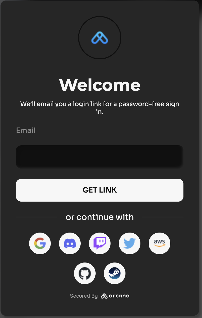
The figure below shows the built-in login UI plug-and-play pop-up authentication screen for a test app.
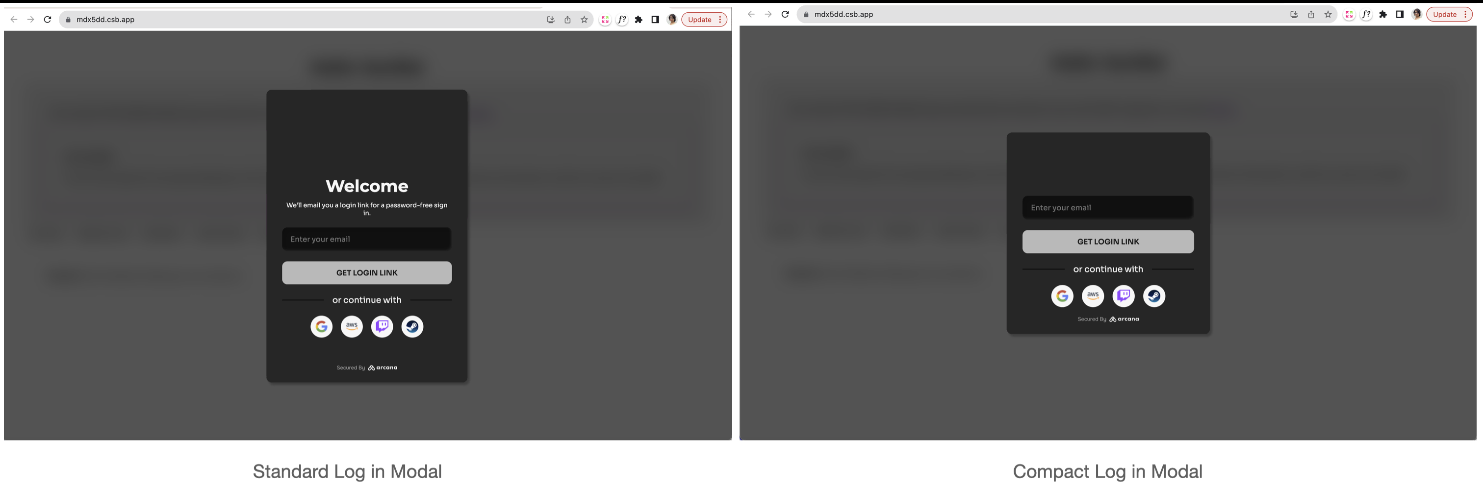
Compact Login UI
You can choose to use a compact form of the built-in login UI modal instead of the regular one.
No plug-and-play support for Firebase authentication.
The plug and play feature of the Arcana Auth product is not supported for Firebase. Developers must build a custom login UI and add code to onboard users. For details, see onboarding users via Firebase and custom login UI
For auth-react SDK usage details, see Arcana Auth React SDK Reference Guide.
That is all!
The plug-and-play user onboarding feature is successfully enabled in the 'React/Next.js' Web3 app.
What's Next?
After enabling the plug-and-play user onboarding feature in the app, developers can use other Arcana Auth product features and enable Web3 wallet operations for authenticated users. See Arcana Auth SDK Usage Guide, how to enable the Arcana wallet for details.
See also
- Configure authentication providers
- Build custom login UI
- Arcana Auth SDK Errors
- Arcana Auth SDK Usage Guide
- Arcana Auth SDK Reference Guide